Project
Aether Airlines Website
Project Overview
About
A school project creating a website for our personal brand.
Timeline
6 weeks
Tools
- Figma
- Github
- VS Code
- HTML/CSS/JS
Role
- Interface Designer
- Programmer
Research & Discovery
Brand Identity
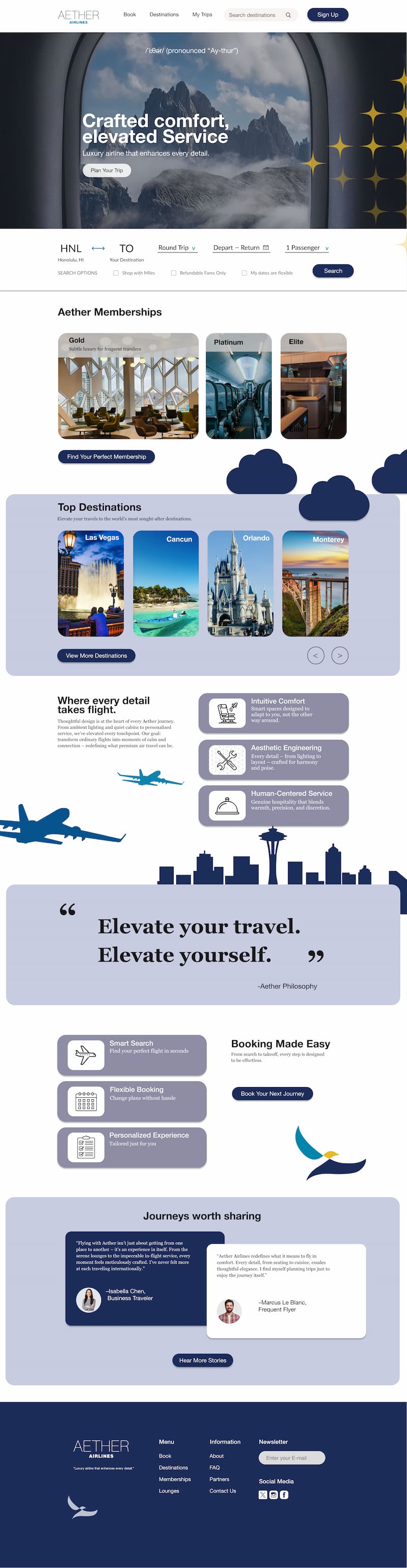
Aether Airlines was positioned as a luxury, experience-driven airline targeting travelers who value comfort, aesthetics, and intentional travel. The brand leans into calmness, minimalism, and a sense of escape.
Competitive Research
I reviewed airline websites ranging from budget carriers to premium brands to identify common UX patterns, visual overload issues, and opportunities to differentiate through whitespace, motion, and storytelling.
User Experience Goals
- Reduce visual noise commonly found on airline websites
- Create a sense of calm and anticipation
- Emphasize experience over logistics
- Guide users through the site intuitively using scroll-based storytelling

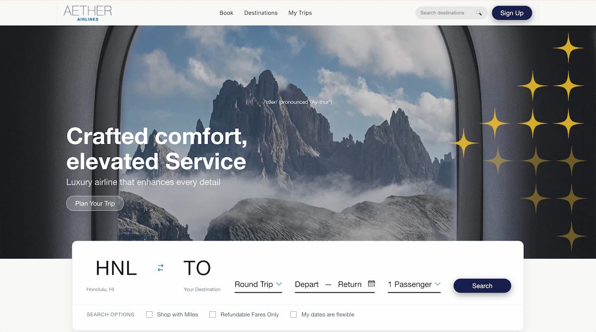
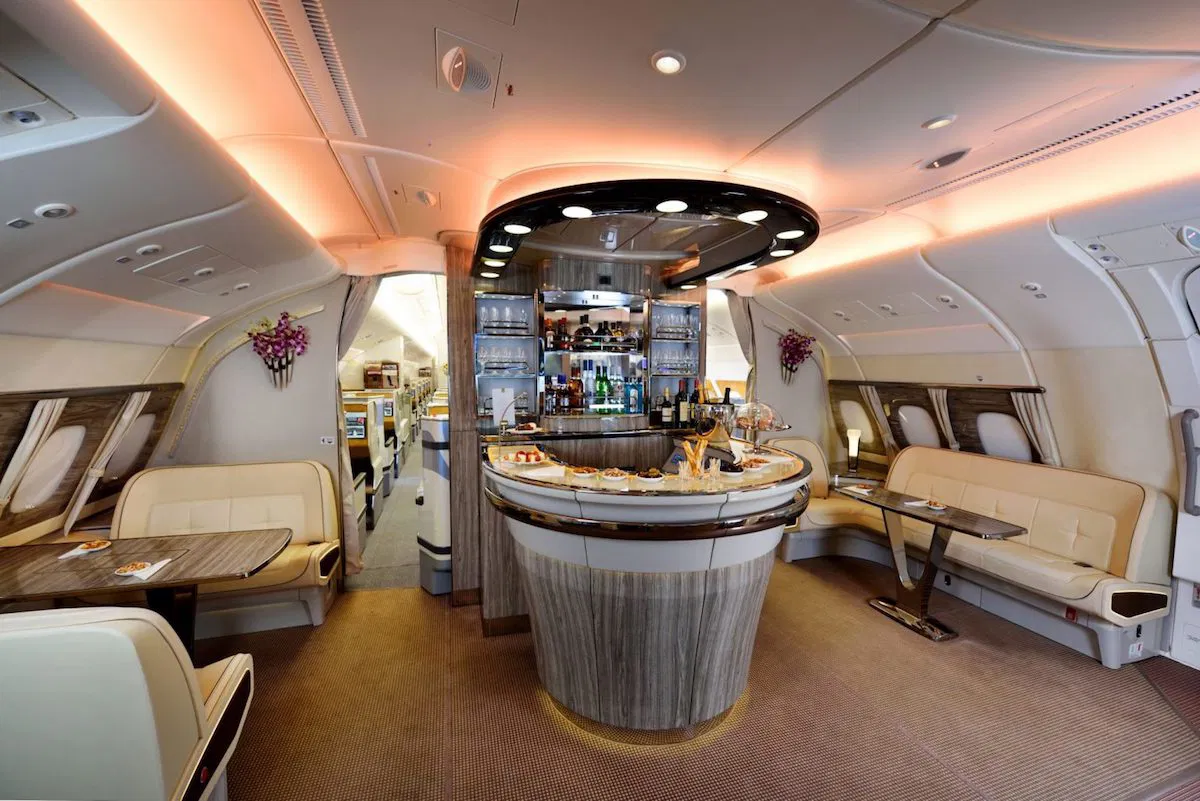
Moodboard
- Soft gradients and vibrant lighting
- Air, clouds, sky, and horizon imagery
- Luxury editorial layouts
- Calm, futuristic, and cinemated references
Reference Images
- High-end travel editorials
- Luxury hotel and fashion websites
- Airline cabin photography
- Minimalist UI layouts with immersive visuals
Design Challenge
How might I design an airline website that feels luxurious and emotiona without sacrificing clarity and usability?
Process & Outcome
Sketchbook Concepts
Early ideation began with hand-drawn sketches to explore layout structure, visual hierarchy, and how content would be revealed through scrolling. Rather than presenting all information at once, the sketches focused on pacing—using scroll progression to create a calm, immersive experience.
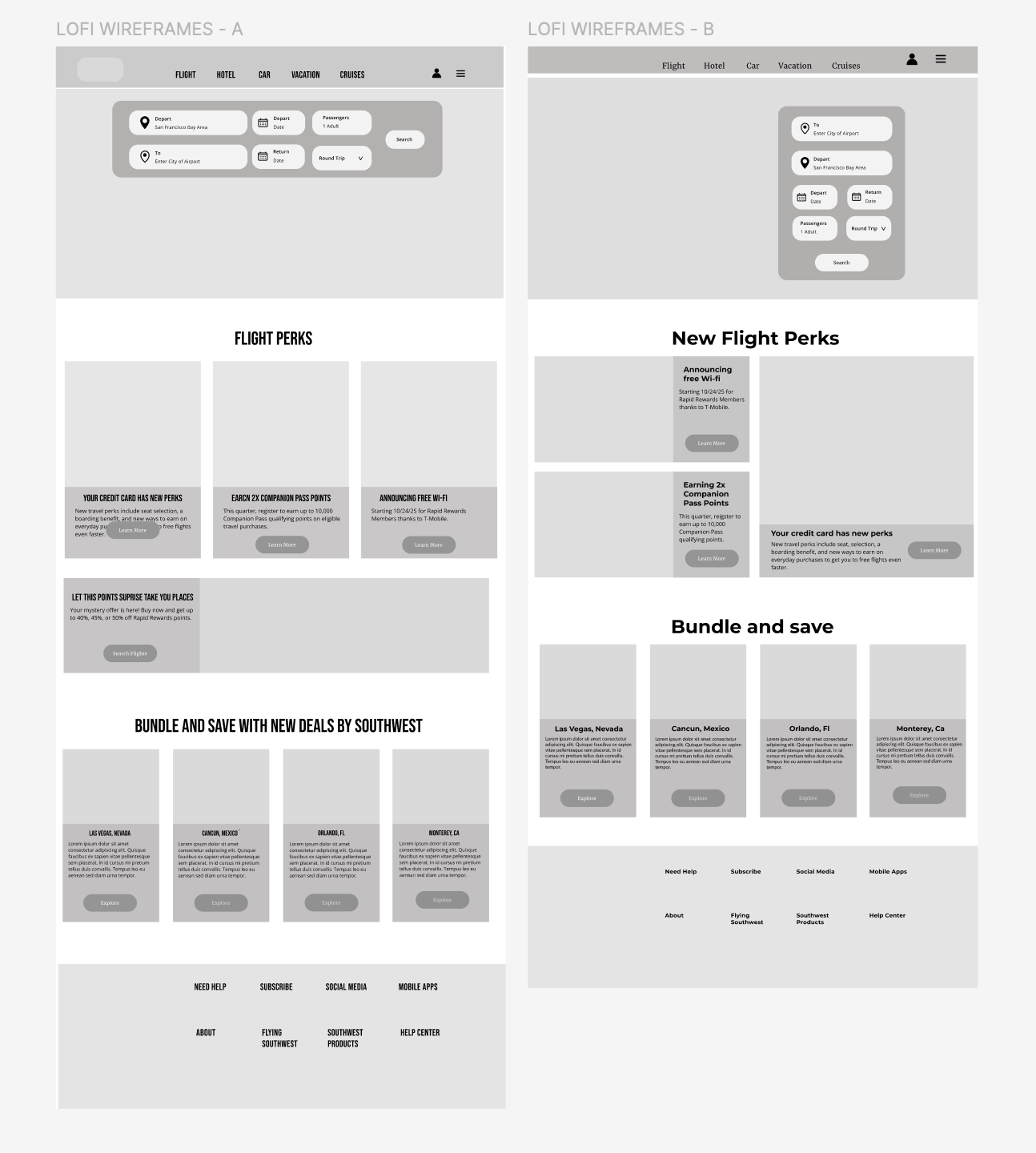
Low-Fidelity (Lo-Fi) Prototypes
Lo-fi wireframes established the overall structure and user flow without visual styling. The focus was on:
- Navigation placement
- Scroll hierarchy
- Section order
- Content grouping
This stage allowed for quick layout iteration before introducing motion or branding.
Scroll-Triggered Interaction Design
Scroll-triggered animations were intentionally used to support storytelling rather than distract from it. Motion was introduced gradually to guide attention and reinforce a sense of lightness and flow associated with air travel.
- Timing animations to activate as sections enter the viewport
- Using subtle fade, translate, and scale effects
- Avoiding excessive motion that could overwhelm users
- Ensuring animations enhanced hierarchy and readability
Animations were implemented using CSS and JavaScript scroll triggers and tested to maintain performance and accessibility.
Mid-Fidelity (Mid-Fi) Prototypes
Mid-fi prototypes integrated spacing, typography hierarchy, and early motion planning. This phase helped refine:
- Section rhythm during scrolling
- How animations aligned with content hierarchy
- Visual pacing between text and imagery
Mid-fi testing ensured the site remained intuitive and readable as motion was layered in.
High-Fidelity (Hi-Fi) Prototypes
Hi-fi prototypes finalized the visual language and interaction behavior, closely matching the final coded site. This stage included:
- Final typography and color palette
- High-quality imagery and gradients
- Fully implemented scroll-trigger animations
- Polished layout and spacing
The hi-fi prototype served as a direct reference during development and ensured consistency between design and code.
Final