Project
Booking.com Website Re-design

Project Overview
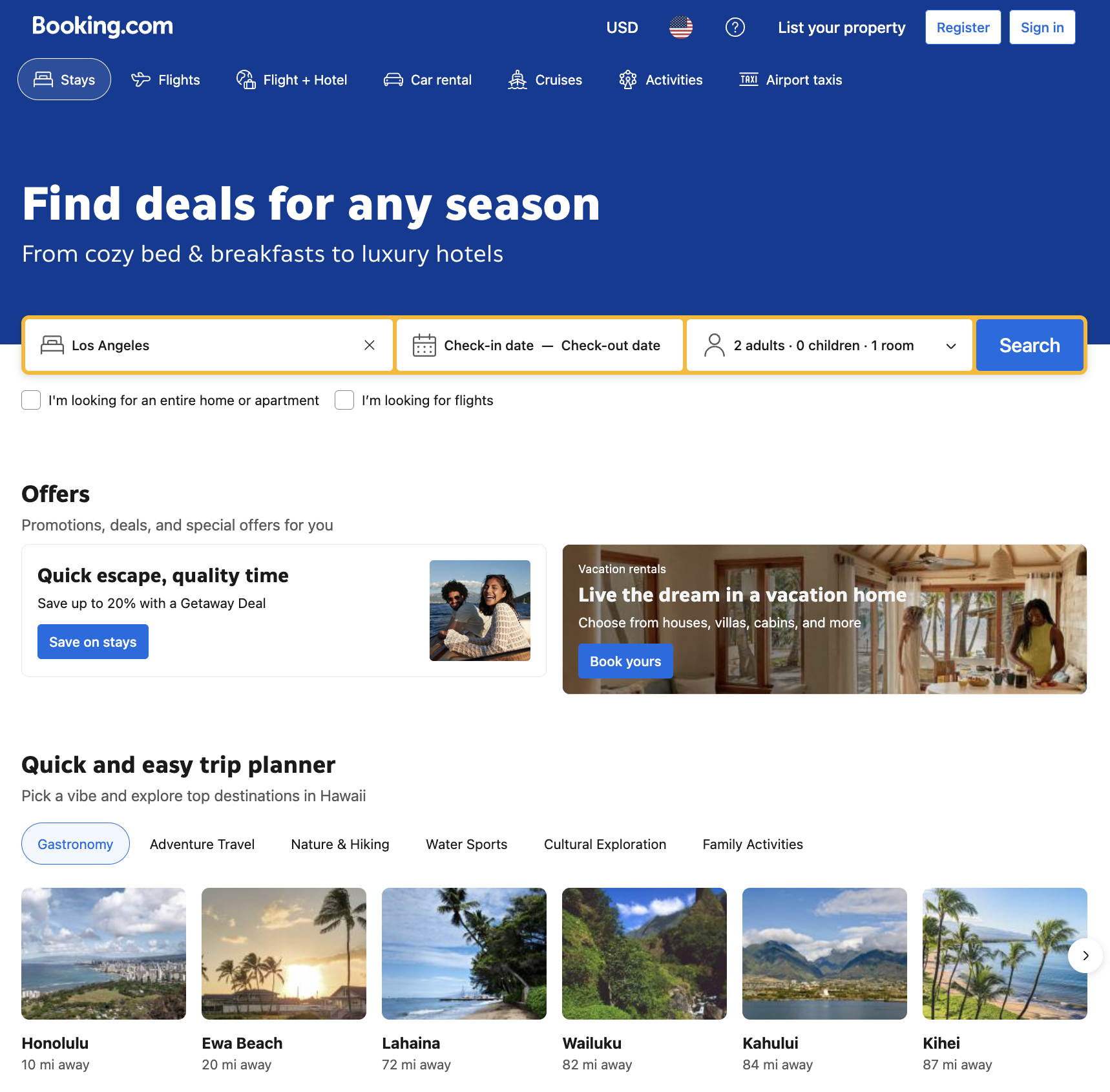
Booking.com - Original Design
About
A web redesign project aimed at improving Booking.com's online experience by making the site more inviting and breaking the white background by adding abstract elements.
Timeline
5 weeks
Tools
- Figma
Role
Web Designer
Research & Discovery
Choosing the Brand
Selected Booking.com for its ease with booking flights and hotels all on one web-page.
User Persona Insights
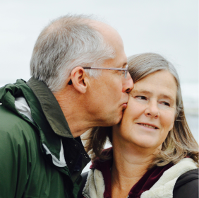
Lisa & Mark
A retired couple that loves to travel. They prioritize getting the best deals, curted recommendtions, and a seamless booking experience.

Emily
An independent travel that thrives on spontaneity and adventure. Emily likes to book last minute weekend getaways and needs a quick hassle-free way to secure accomodations.

David
A frequent business traveller. He prioritizes efficiency, reliabiikty, and loyalty perks when choosing accomodations.
Competitive Research

Expedia.com
Another travel platform but with a different UI approach.

Airbnb
Focuses on experiences and unique stays with a more personalized feel.

Google Travel
Streamlined trip planning with an emphasis on recommendations.
Moodboard & Style Tiles
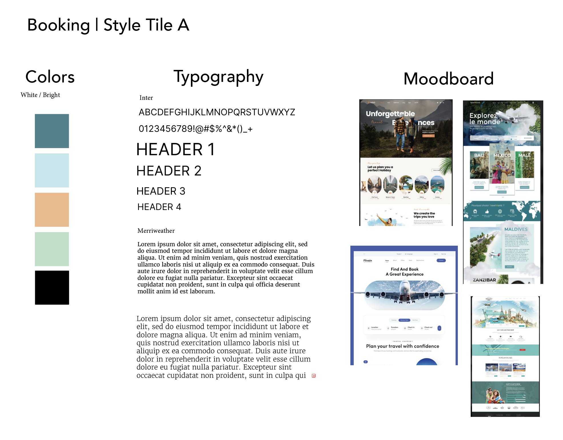
Style Tile A
- Darker/Neutral colors
- Use of whitespsce
- Minimal design
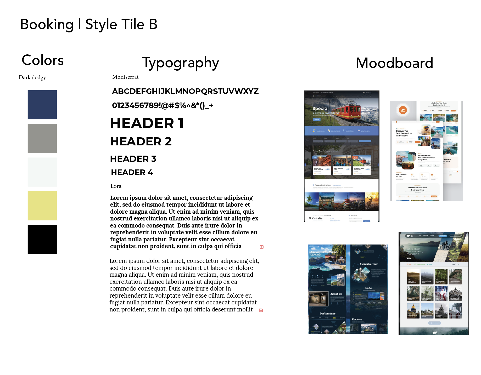
Style Tile B
- Brighter colors
- Abstract shapes in background
- Play with font in images
Design Challenge
Goals
- Promote membership options
- Highlight class variety
- Encourage wellness lifestyle
- Simplify site navigation
- Boost user engagement
Constraints
- Designing for multiple user age groups and skill levels
- Keeping it accessible for users with varying tech skills
- Balancing calming aesthetic with clear structure
Process & Outcome
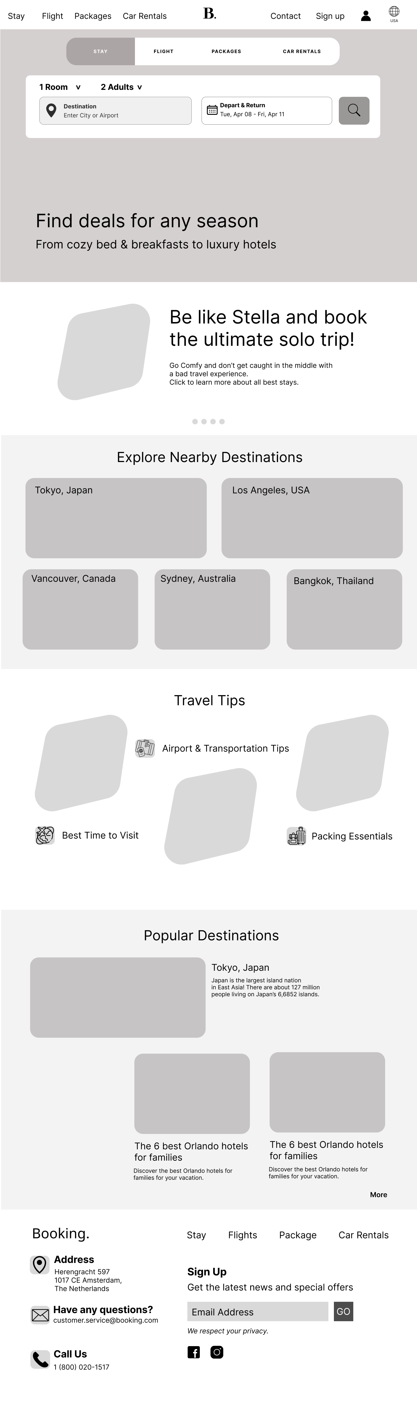
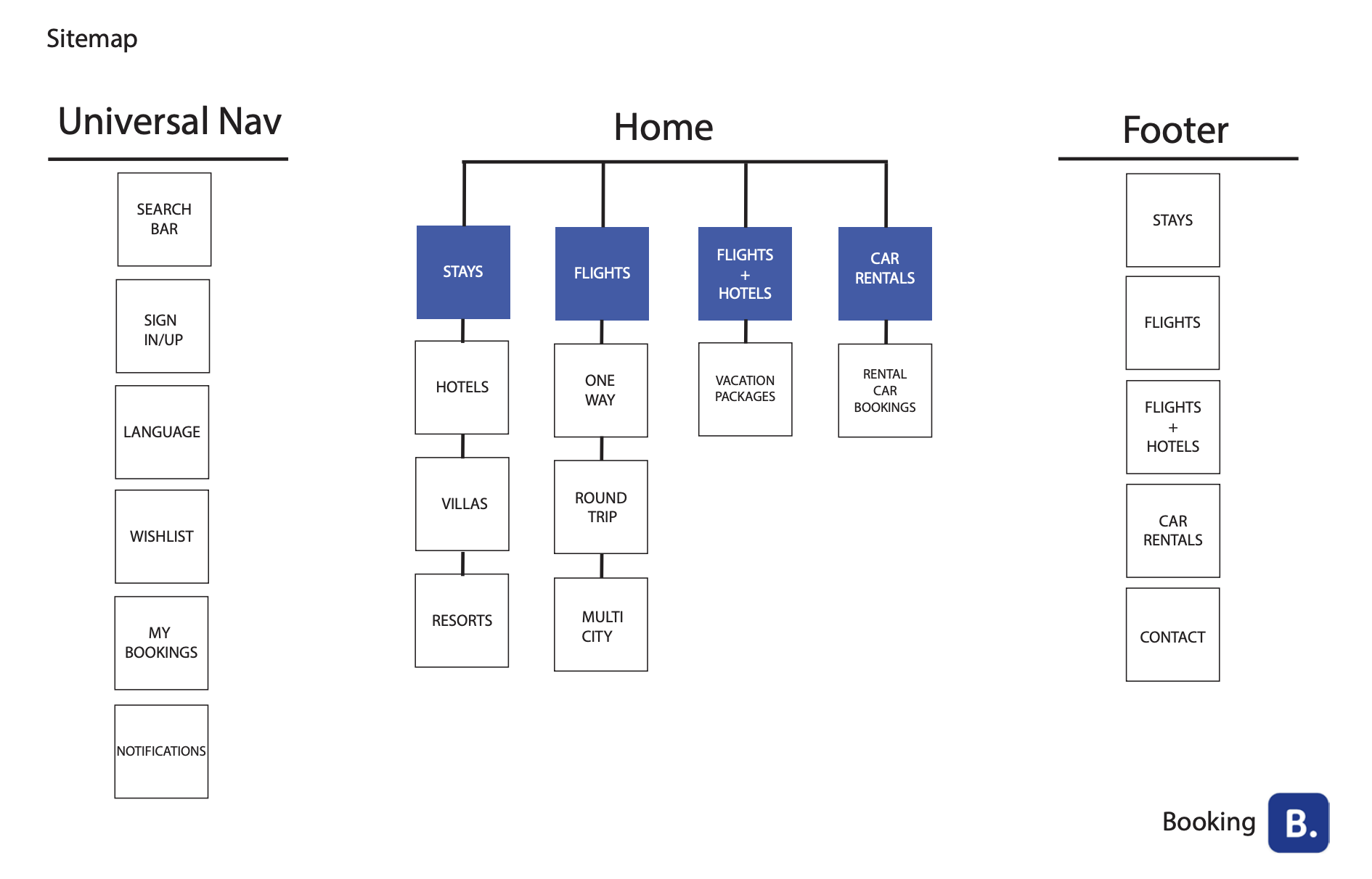 Preview Sitemap
Site Map
This sitemap laid out a mutli-page structure on how to execute each page and what would be required.
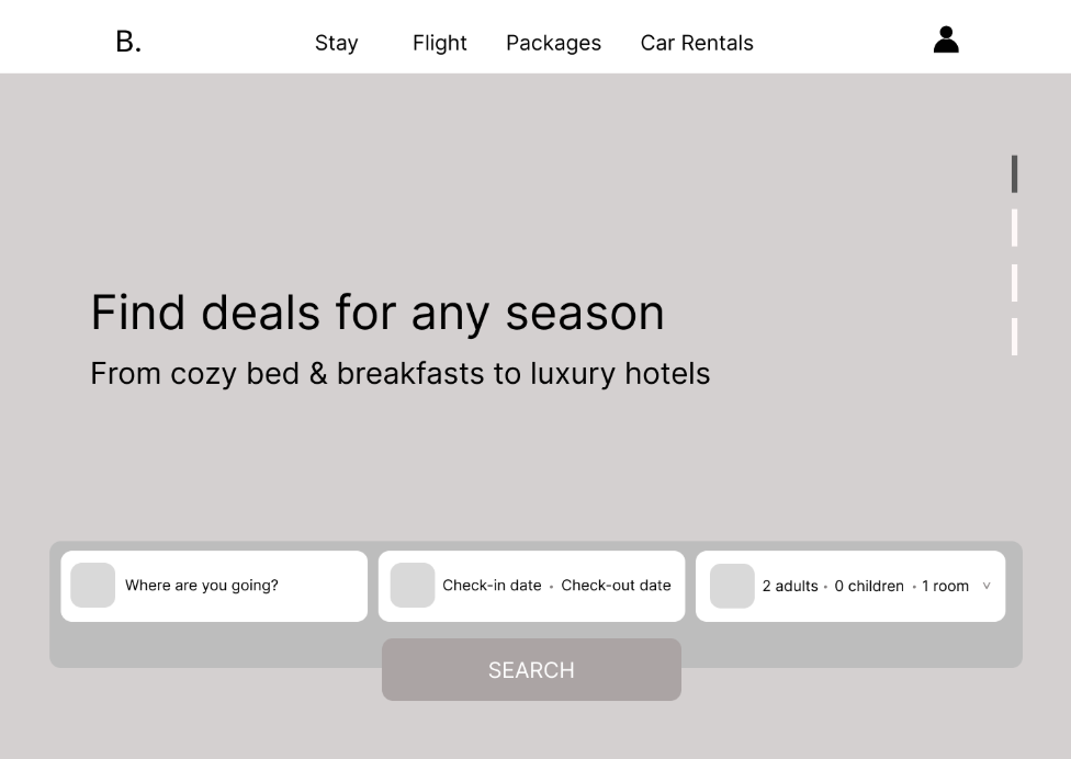
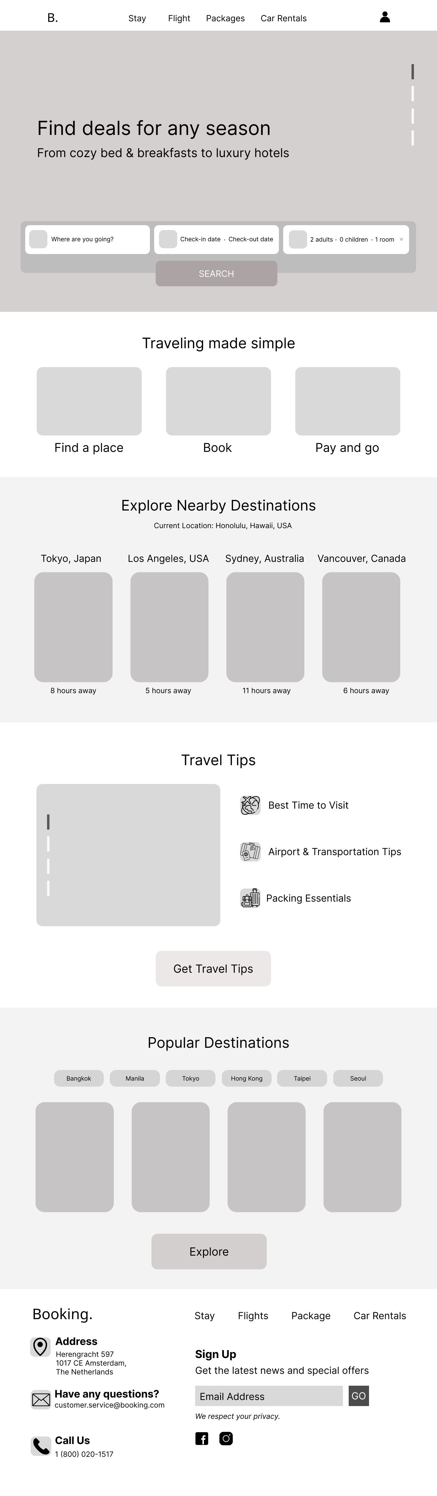
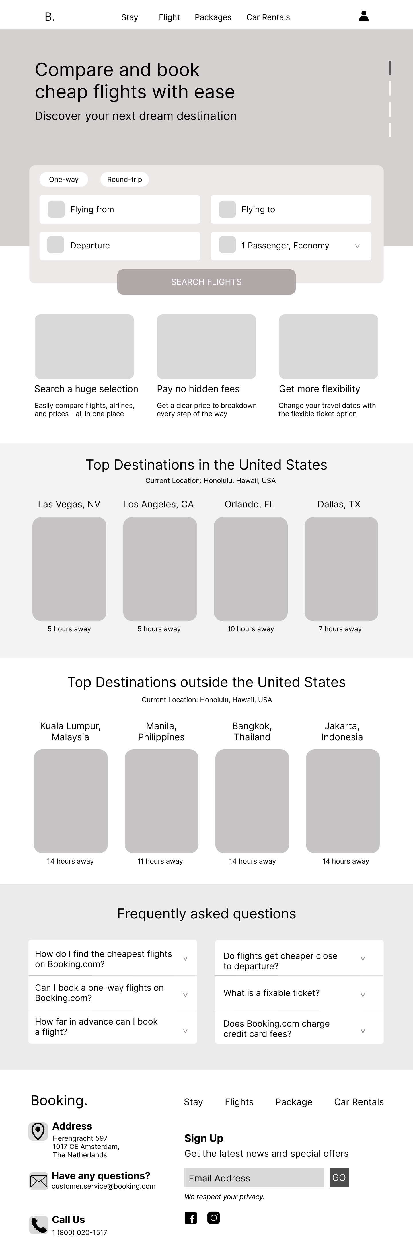
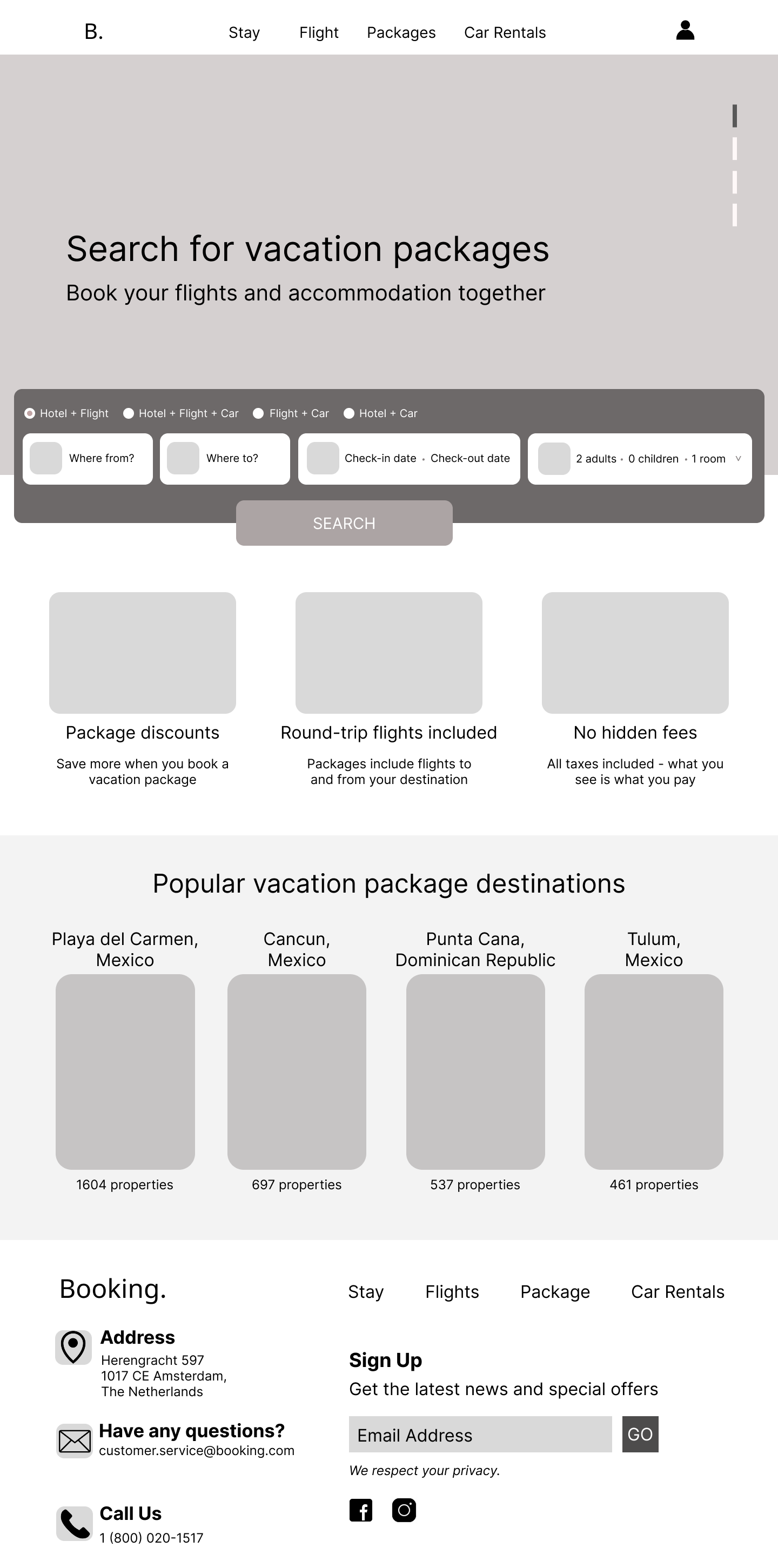
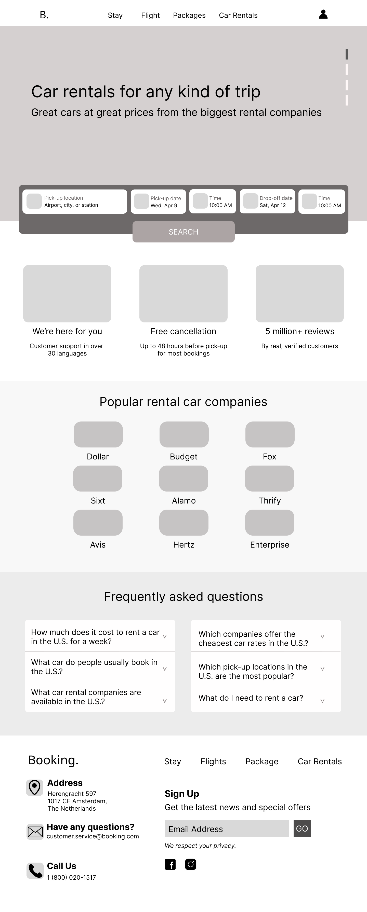
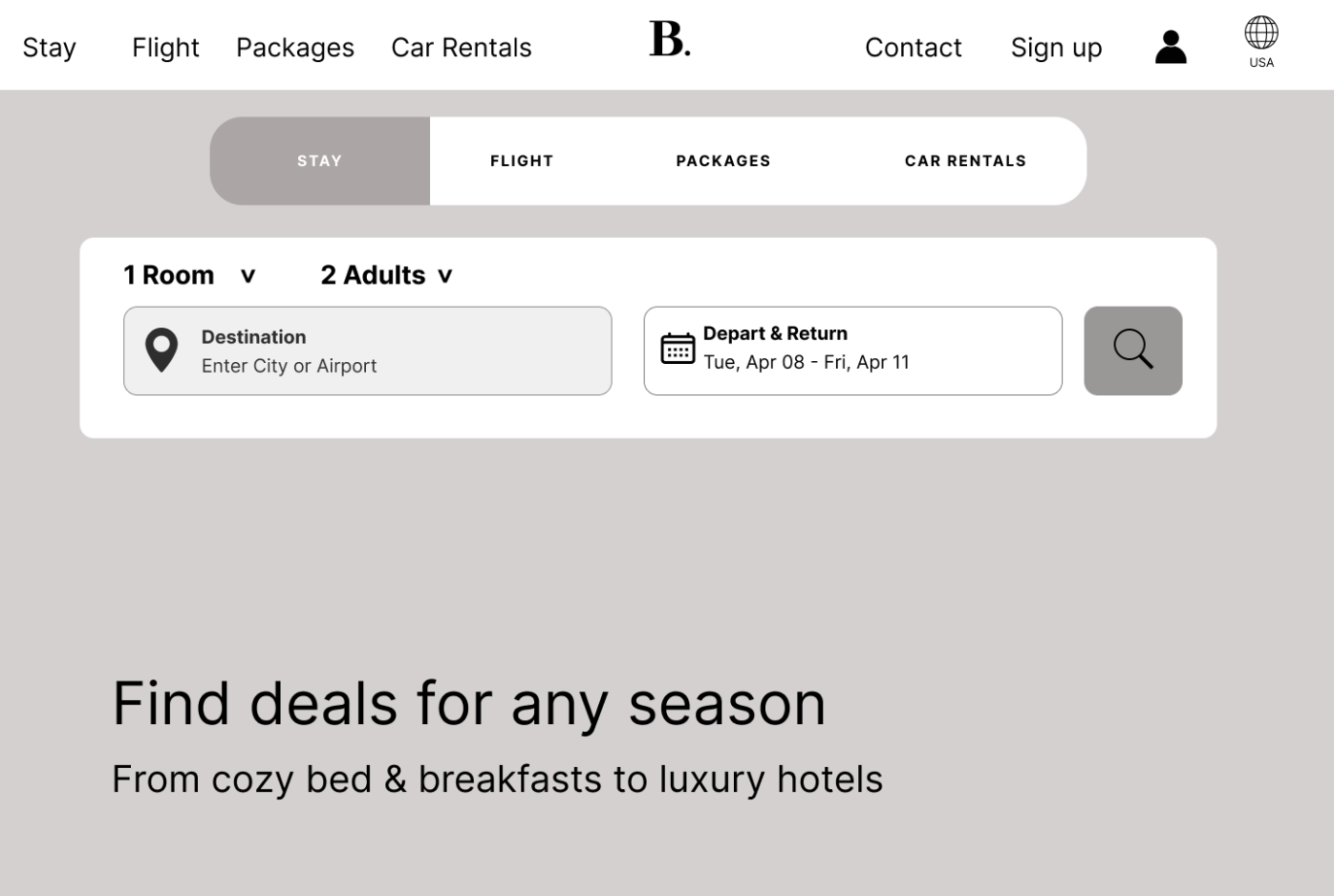
Wireframe Ver. 1
This wireframe was designed with a focus on breaking up the flow of sites to also include information about booking.com like: discounts, round-trips, and no hidden fees. The site nav would have the logo on the left and main subpages in the middle.
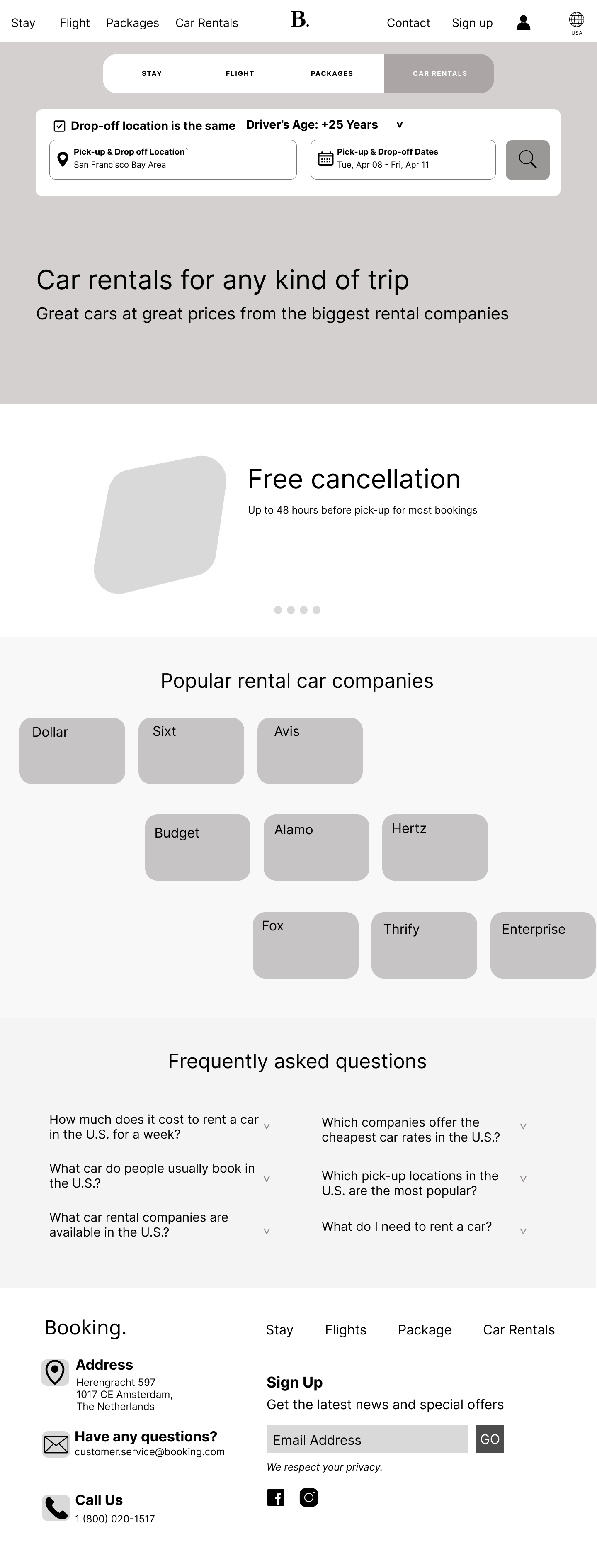
Wireframe Ver. 2
This wireframe would break the content with customers as the main focus and including information about the subpage and exciting features included. Having the images of the locations in a bento style format. The site nav also has the logo in the middle and the subpages on the left.
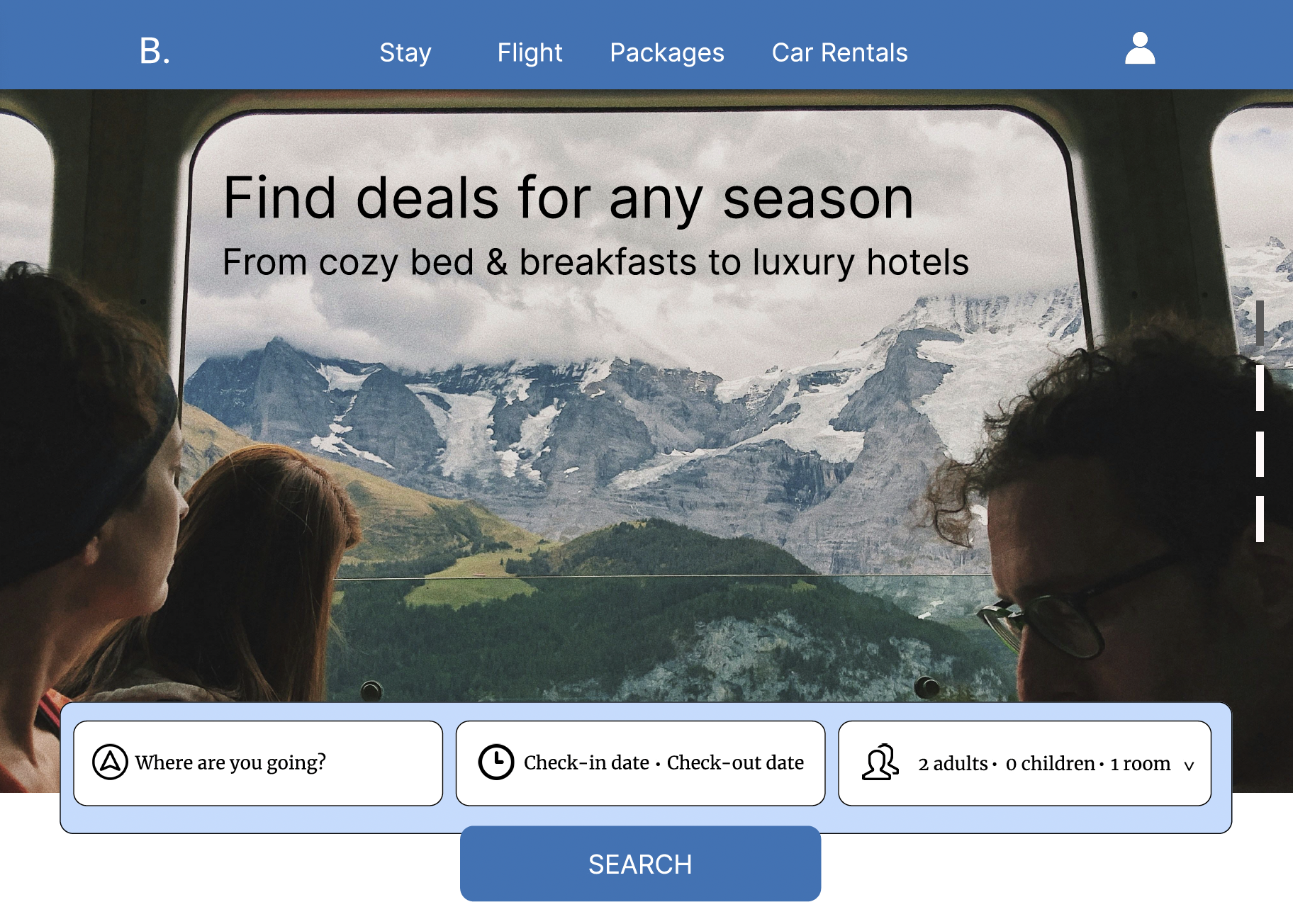
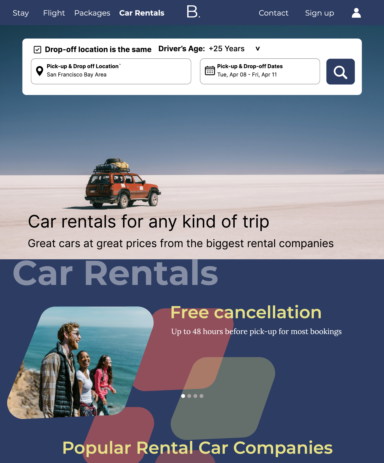
Concept Design 1
In this design, I used a lighter blue and had the search bar on the bottom. I incorporated cartoon illustrations that had yellow and orange. However, these illustrations on the web page lacked consistency with the design I had.
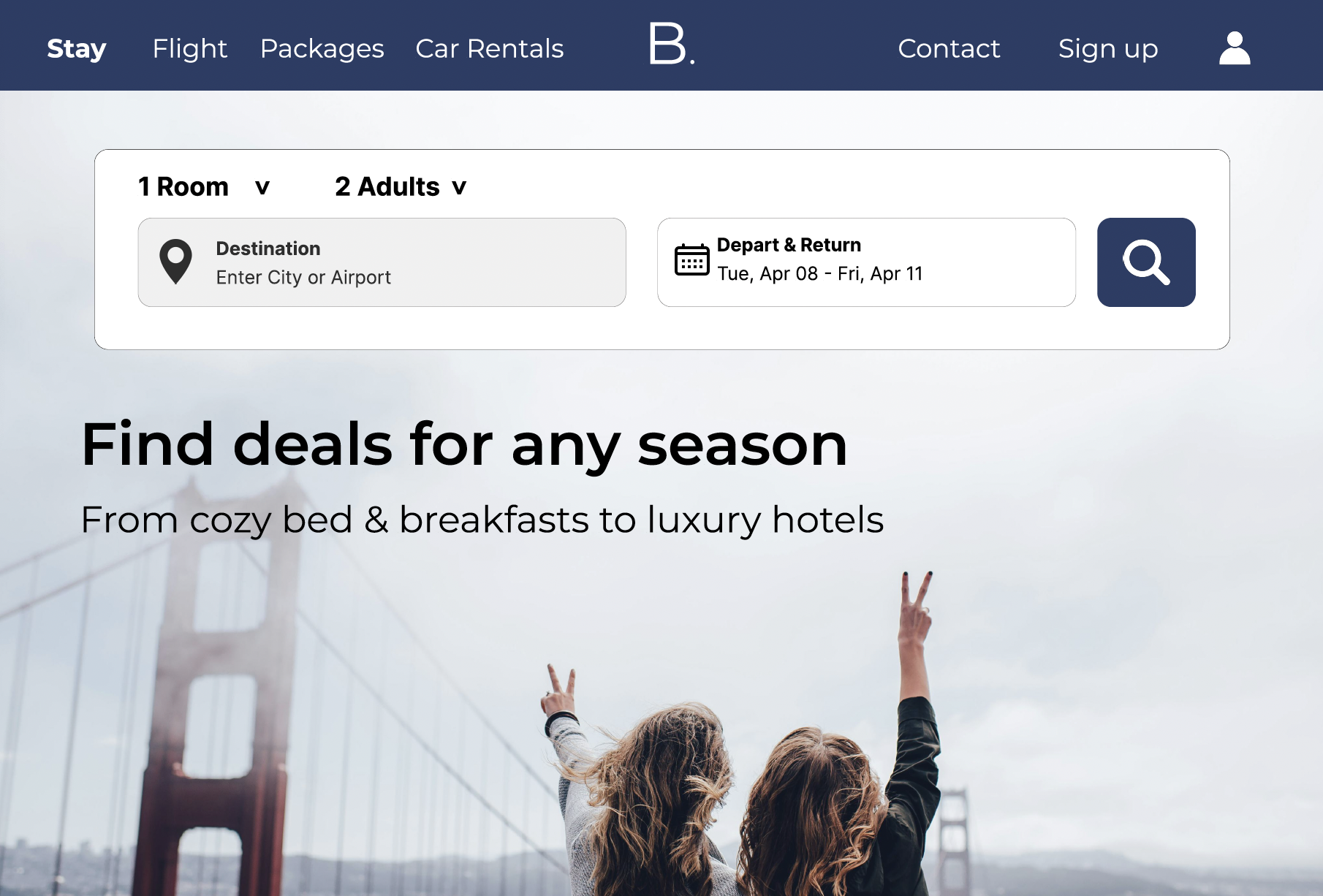
Concept Design 2
In this design I used a darker blue for the entire background and site nav. I made the search engine more modern and minimalistic. I carried the blue color throughout the page and had highlighting colors of yellow and red. I incorporated shapes instead of illustrations to break the grid-like flow.
Style Tiles / UI System:
Reflection
I learned a lot with experimenting with a white background and a dark color background. I played with illustrations and shapes to break the border. I used a bento style image grid and played off that within the background in concept 2.