Project
Logo Design – Olympic Sport Symbols
Project Overview
About
Redesigning a unique Olympic Sports Symbol.
Timeline
5 weeks
Tools
Illustrator
Role
Graphic Designer
Research & Discovery
Understanding Olympic Pictograms
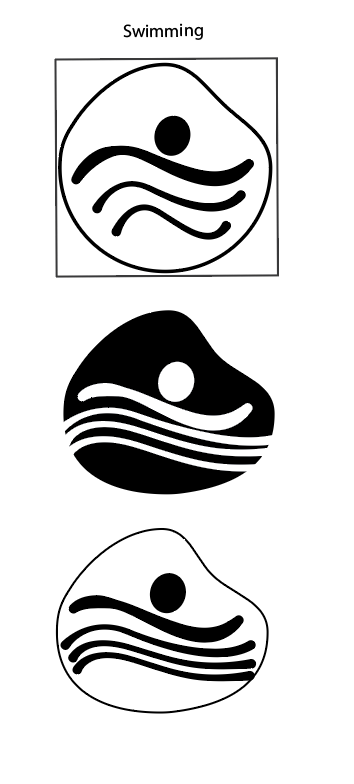
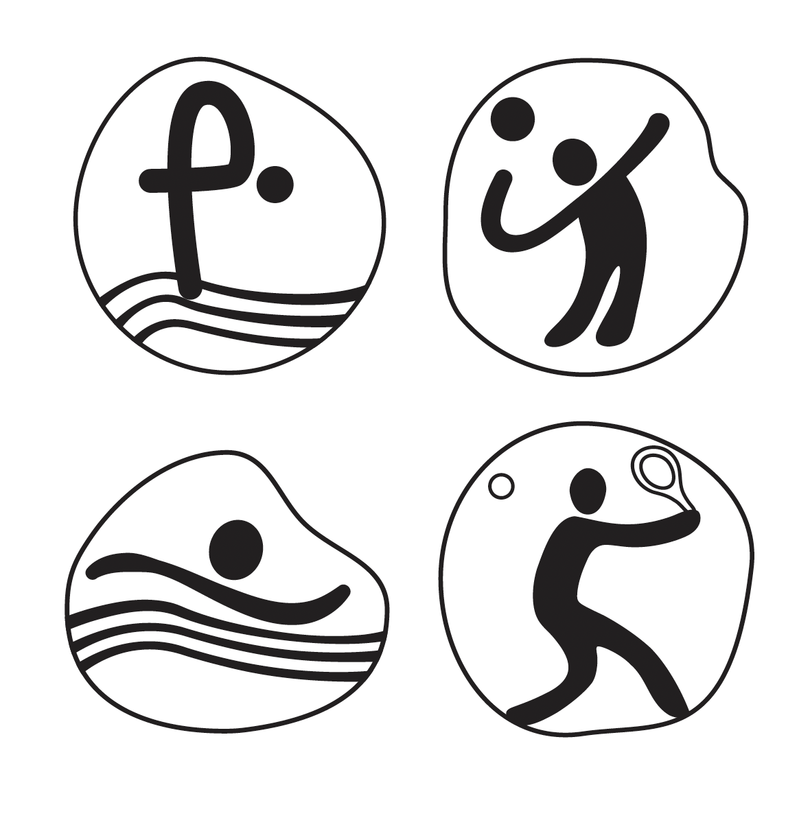
When it came to researching the history of Olympic sport symbols. I was inspired by their main purpose: to translate an image through language barriers and instantly communicate a sport through universal shapes and motion. Researching past Olympic games like Montreal 1976, Beijing 2008, and Rio 2016 showed me an evolution from highly detailed figures to organic shapes. I chose to focus my redesign on four Summer sports—Swimming, Volleyball, Diving, and Badminton—to explore how I could capture their dynamic energy while maintaining its meaning.
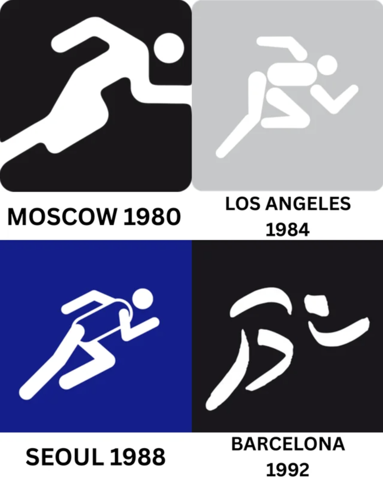
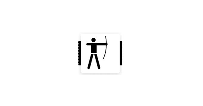
 Montreal 1976
 Beijing 2008
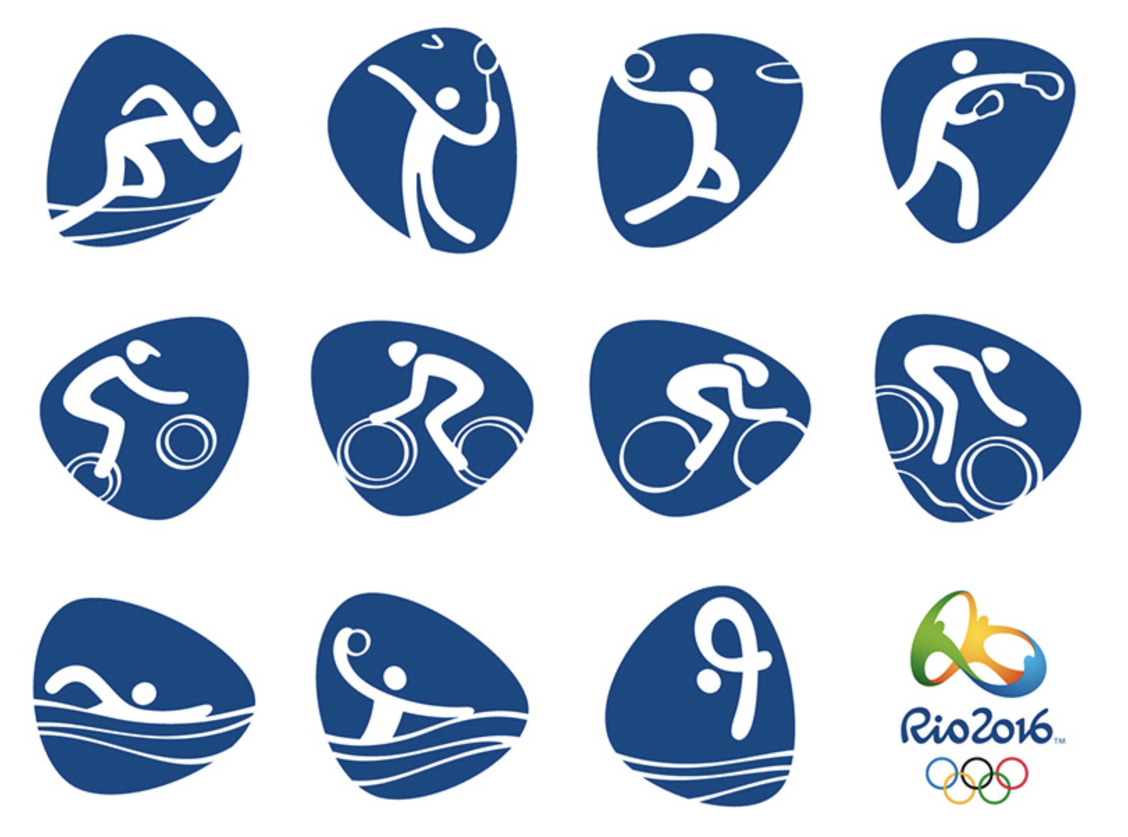 Rio 2016
Design Challenge
“How can I use organic shapes to create a modern and joyful set of Olympic symbols?"
Process & Outcome
The Idea of Flow and Movement
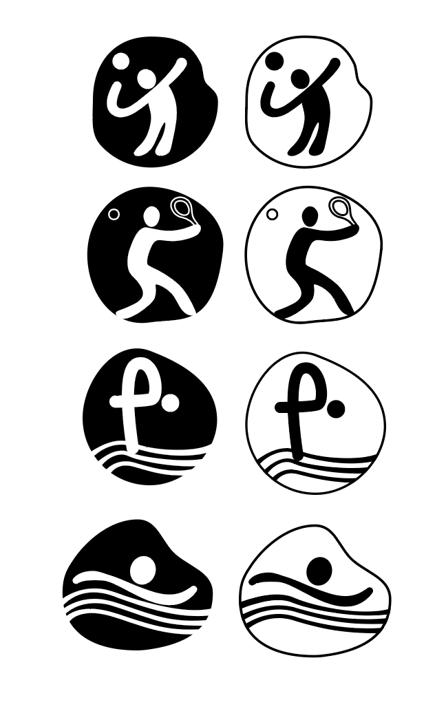
My research led me to a main idea: flowing energy. I wanted to move away from still images and show the non-stop motion of an athlete. My moodboard focused on water—its waves and drops—to inspire this feeling of movement. I used soft, blobby shapes to create a sense of fun and modern energy. This look and feel helped me design symbols that show not just the sport, but the action and feeling of playing it.
Reflection
Through this project, I learned how to turn the idea of "flowing energy" into a simple design. I used minimal, fluid lines to express the detailed motion of each sport. The biggest challenge was focusing on the essential shape of the body and the movement of the lines to make each symbol stand out while still feeling part of one family.