Project
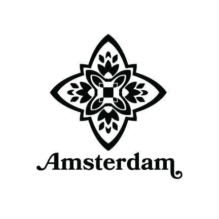
Tourist Logo - Amsterdam
Project Overview
About
Creating a tourism logo for Amsterdam.
Timeline
5 weeks
Tools
Illustrator
Role
Graphic Designer
Research & Discovery
Defining Amsterdam
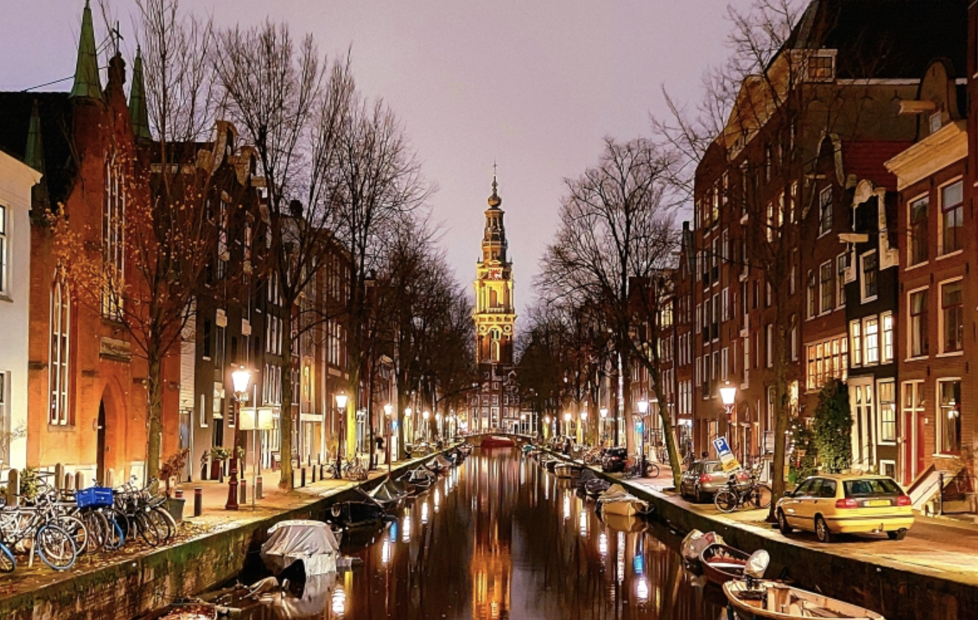
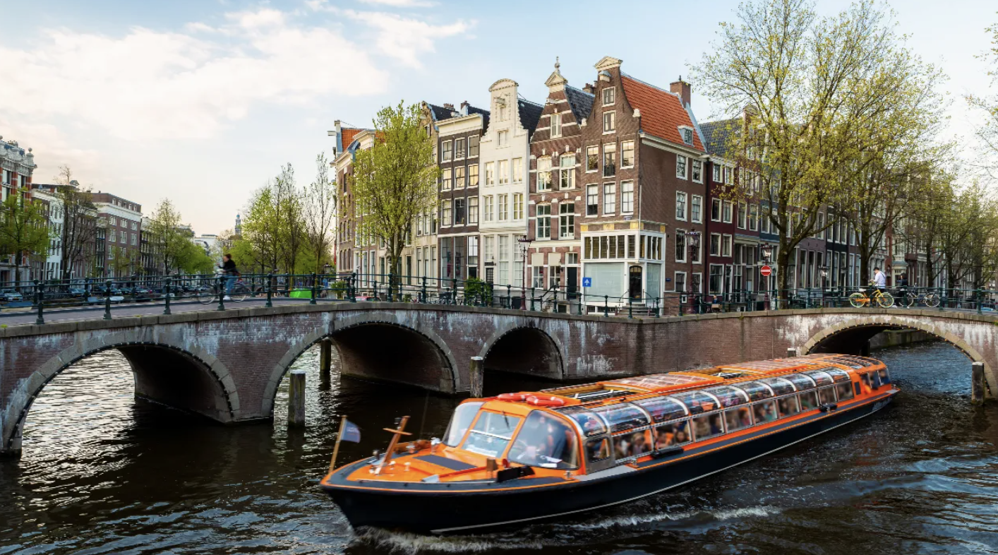
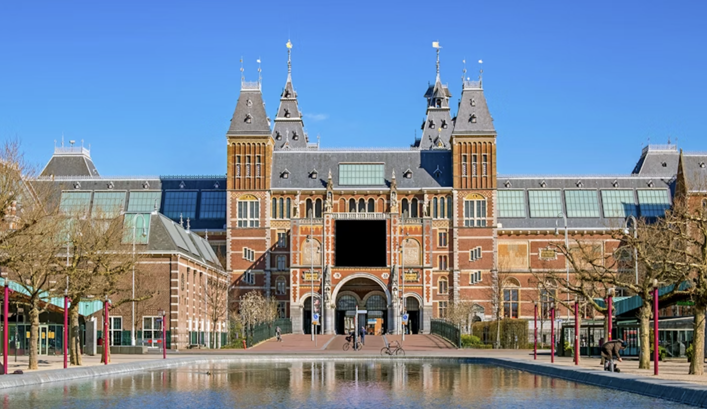
To determine what best represents Amsterdam, I explored the city’s culture, history, and landmarks. Amsterdam is defined by its canals and bridges, as well as its identity as one of the most bike-friendly cities in the world. I also looked into historical and cultural landmarks such as Anne Frank’s house, Dam Square, the Rijksmuseum, and the Van Gogh Museum. From this research, key themes emerged: water and cycling as everyday life, rich artistic heritage, and deep historical influence. These elements became the foundation for how I visually represented Amsterdam in the tourism logo.
Design Challenge
“How can I represent Amsterdam in a single image?"
Process & Outcome
Moodboard
I first explored what other location logos looked like. However, it was important for me to not just explore many concepts placed into one design but one symbol to represent the identity of Amsterdam. I explored the cultural and historical parts of Amsterdam to guide my design.
- I looked at tulips, which were important for Amsterdam’s economy during hard times.
- I studied the canals and bridges since the city is built on water.
- I created a diamond-shaped flower to show the tulip in an abstract way.
- I also used a shape from a German design pattern, since many people in Amsterdam have German roots.
Reflection
In the final design, I focused on representing the people and culture of Amsterdam. I used abstract shapes and patterns, like the German-inspired design, to show how outside influences have shaped the city. The mix of tulips, water elements, and patterns gave me a logo that feels true to Amsterdam’s history and identity.