Project
Re-Design Brand Logo - Vaseline
Project Overview
About
Re-designing a skincare logo. Decided on Vaseline for it's skincare essential.
Timeline
5 weeks
Tools
Illustrator
Role
Graphic Designer
Research & Discovery
Describing Vaseline
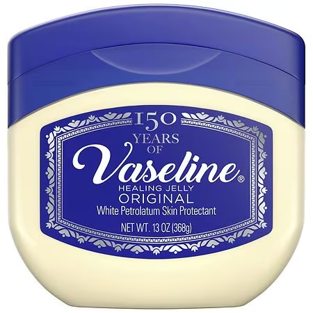
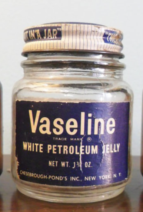
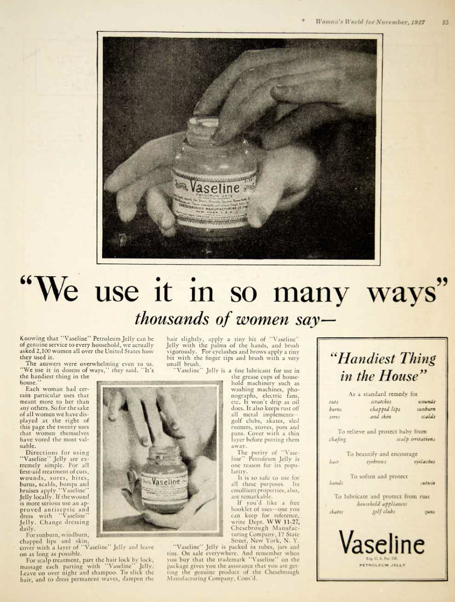
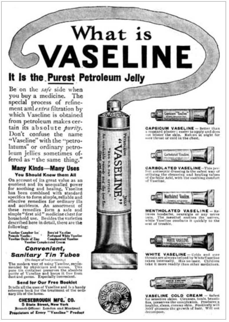
Vaseline is a skincare staple with a long history of trusted and multipurpose use. I did research on its role as a household essential and discovered how popular it became once it first sold in the 1870s. During World War II, soldiers frequently requested Vaseline in letters home. They knew it can protect and heal battle wounds, prevent blisters, and soothe severe dry skin. This became its identity and its core brand values in my mind: protection, healing, and unwavering reliability.
Design Challenge
“How can I describe Vaseline into a symbol?"
Process & Outcome
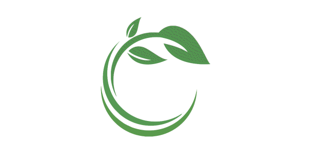
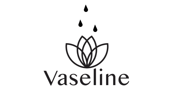
Moodboard
The moodboard was designed to translate Vaseline's core attributes—healing, luxury, and multipurpose nature—into a visual language. I explored circular shapes to symbolize protection and wholeness, and water droplets to directly communicate its moisturizing effect. To convey trust and professional reliability, I focused on a clean, sophisticated aesthetic with uniform, consistent typefaces that reflect the product's dependable purpose.

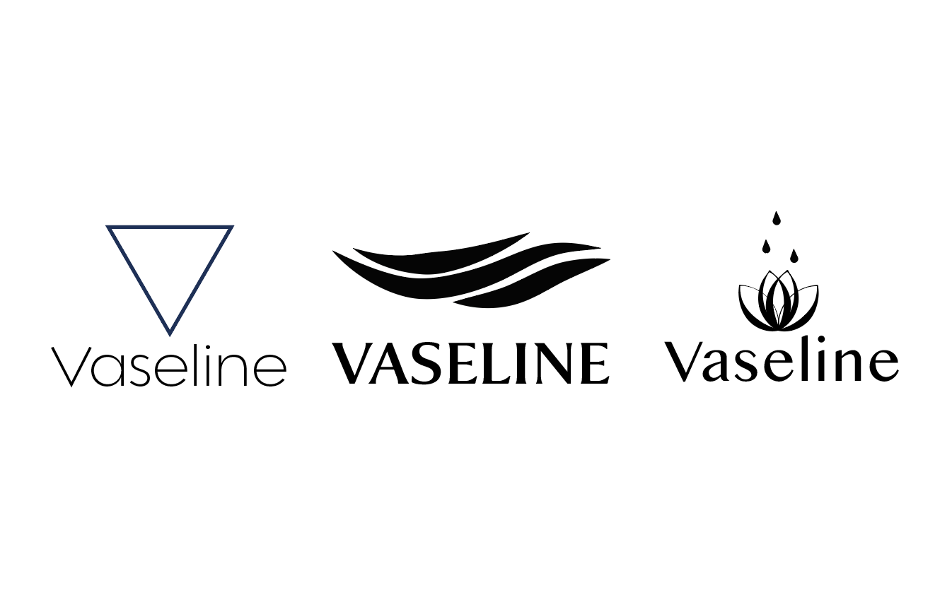
Reflection
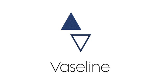
In this logo redesign project, I challenged myself to experiment with shapes, lines, and shading through my sketches and digital designs. I learned the importance of being intentional about the specific message I wanted to communicate to the audience. I finally decided on the lotus design for its uniformity, seen in the delicate lines and symmetrical shape, as well as for its meaning. As a symbol representing purity, the lotus aligns perfectly with Vaseline's purpose: to be seen as purposeful, healing, and moisturizing.