Project
CorePower Yoga Website Re-design
Project Overview

CorePower - Original Design
About
A web redesign project aimed at improving CorePower Yoga’s online experience by making the site more accessible, wellness-driven, and user-friendly.
Timeline
5 weeks
Tools
- Illustrator
- Figma
Role
Web Designer
Research & Discovery
Choosing the Brand
Selected CorePower Yoga for its blend of ancient yoga tradition and modern fitness appeal.

User Persona Insights

Savannah
A busy proessional who uses yoga to de-stress after long workdays.

Ruthie
A college student that does yoga to help relax to focus better in school.

Leila
A retired adult maintaining an active lifestyle.
Competitive Research
YogaWorks
- Focus: Traditional yoga practices with strong teacher training programs.
- Experience: Studio-based classes with a reputation for skilled instructors.
- Weakness: Less emphasis on modern fitness or hybrid styles.

Pure Yoga
- Focus: Luxury yoga experience with spa-like facilities and a variety of yoga styles.
- Experience: Premium memberships, often located in major metropolitan areas.
- Weakness: Less accessible and affordable for the average user.

Equinox
- Focus: High-end fitness club offering yoga alongside strength and cardio training.
- Experience: Emphasizes overall fitness with yoga as one component.
- Weakness: Yoga experience may feel secondary or less community-driven.
Moodboard & Style Tiles
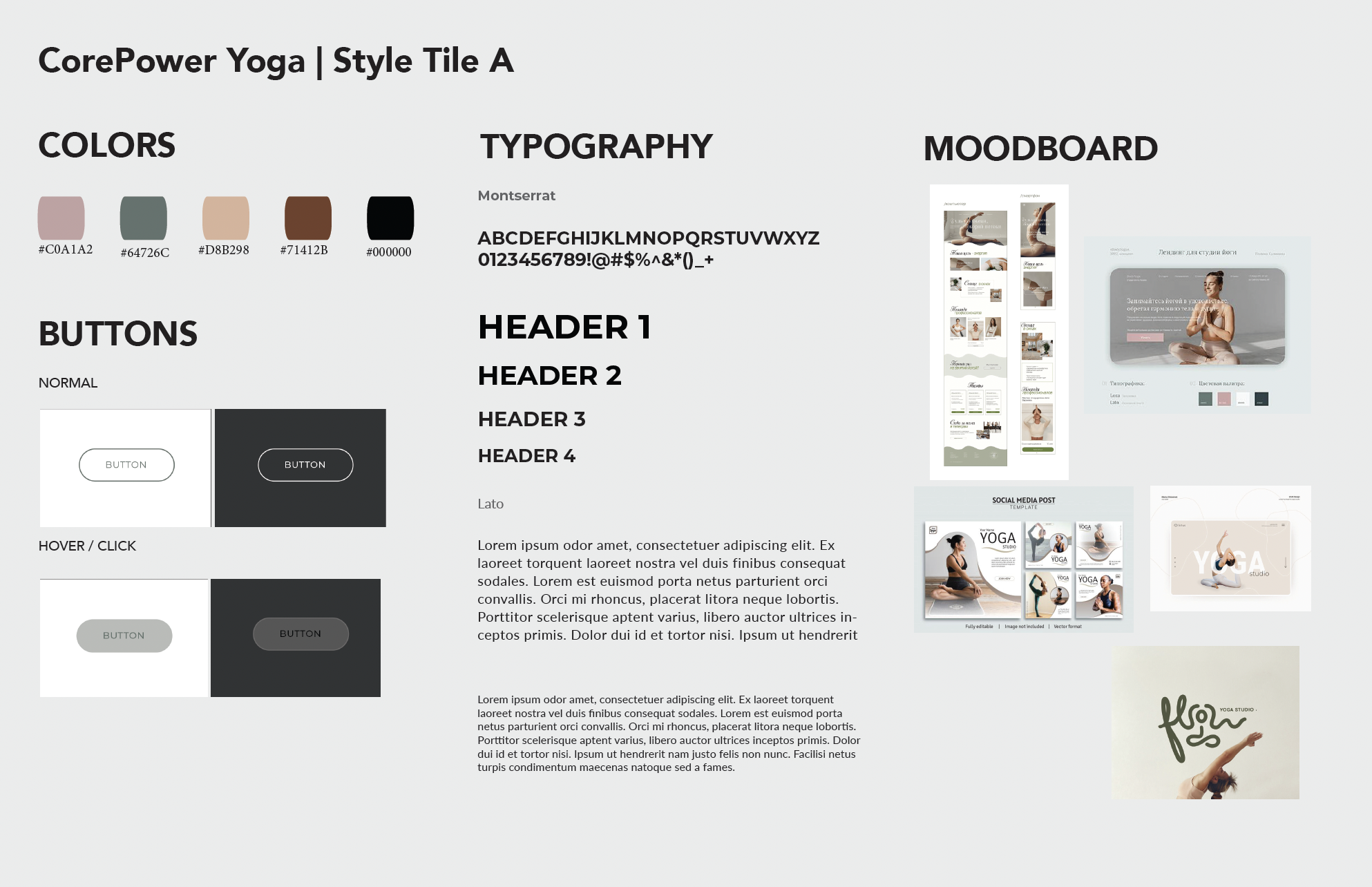
Style Tile A
- Darker/Neutral colors
- Use of whitespsce
- Minimal design
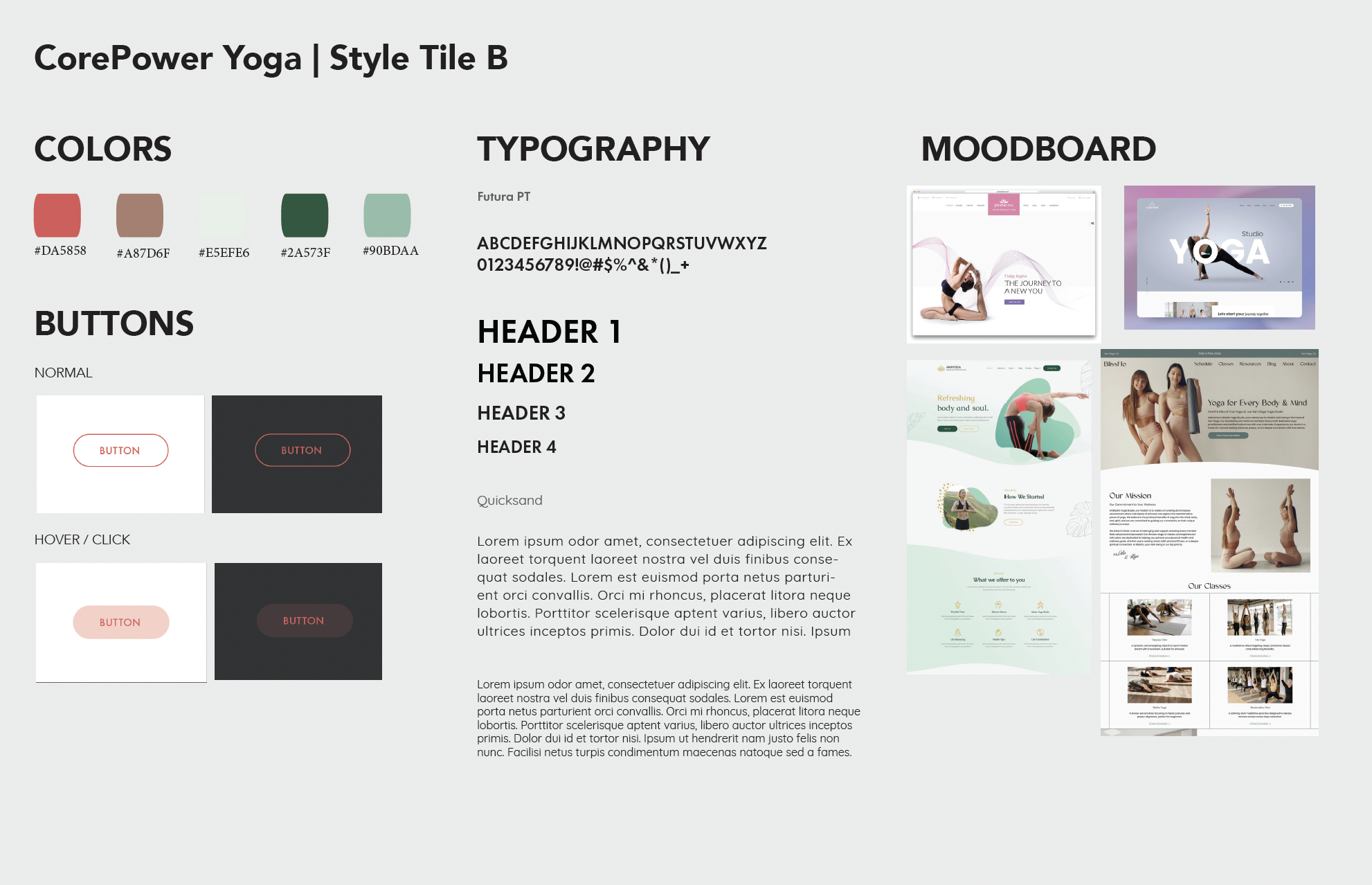
Style Tile B
- Brighter colors
- Abstract shapes in background
- Play with font in images
Design Challenge
Goals
- Promote membership options
- Highlight class variety
- Encourage wellness lifestyle
- Simplify site navigation
- Boost user engagement
Constraints
- Designing for multiple user age groups and skill levels
- Keeping it accessible for users with varying tech skills
- Balancing calming aesthetic with clear structure
Process & Outcome
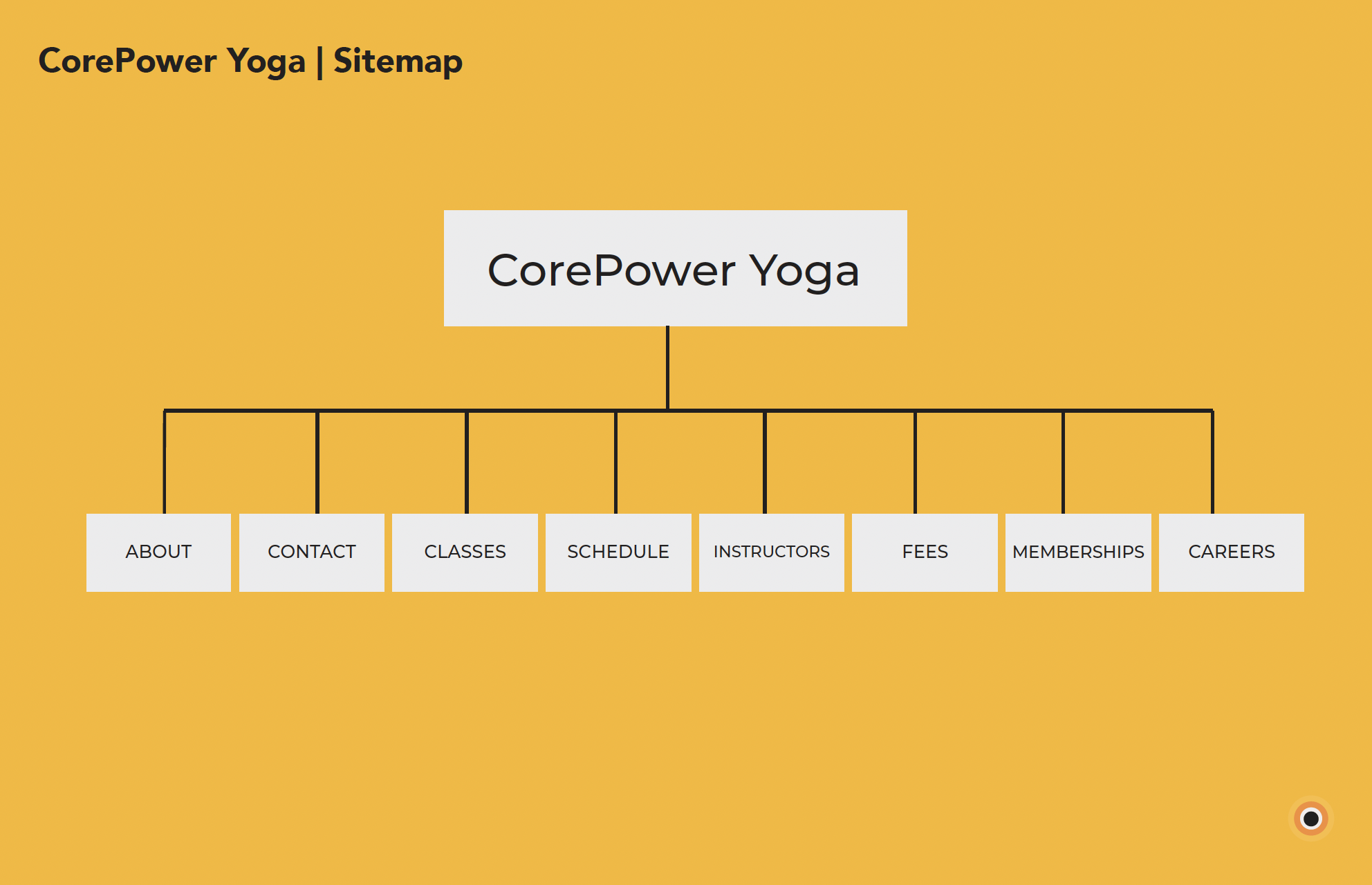 Preview of Sitemap
Site Map
This sitemap helped define a clear content hierarchy before diving into wireframes and UI design. It was essential for planning page relationships and simplifying the user experience.
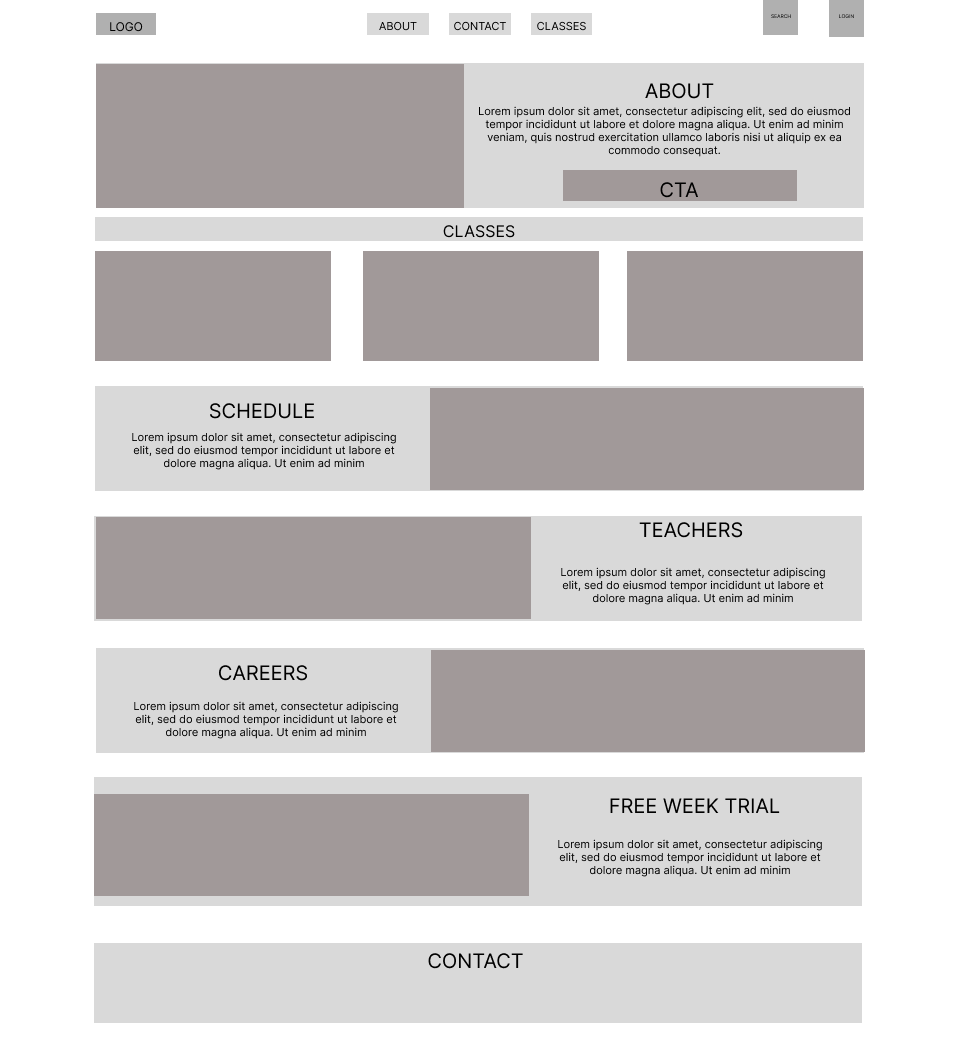 Preview of Wireframe Ver. 1
Wireframe Ver. 1
This wireframe was designed with a focus on user flow and task efficiency. Top navigation includes key links (About, Contact, Classes), while visual modules below support skimmability. Each section uses clear headings and a left-right layout to balance text and imagery. A bold CTA section is placed near the top for quick engagement. The page ends with a Contact block, ensuring users always have a next step. This structure supports both exploration and conversion without overwhelming the user.
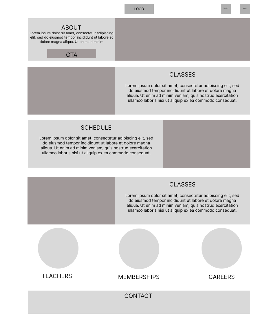 Preview of Wireframe Ver. 2
Wireframe Ver. 2
This low-fidelity wireframe explores a clean and modern homepage design for CorePower Yoga’s website redesign. The structure is built to emphasize clarity, hierarchy, and user action. Key sections like About, Classes, Schedule, and Teachers are prioritized to guide users quickly to essential content. A prominent CTA (Call-to-Action) encourages engagement early, while areas like Careers, Free Trial, and Contact support brand connection and conversion.
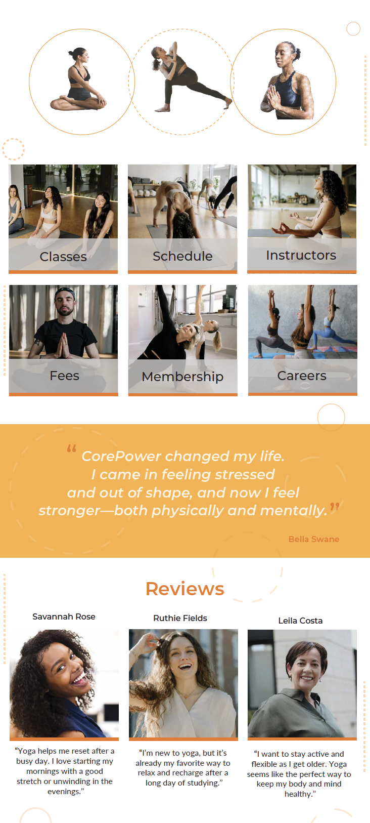
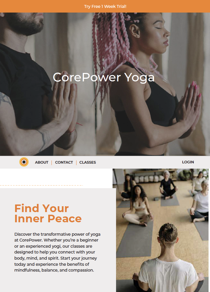 PDF Preview of Concept 1
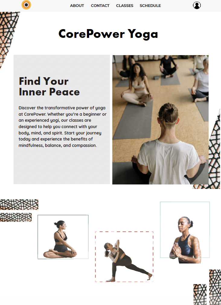
Concept Design 1
I kept the CorePower colors for my re-design but added more elements for Users to browse through the website providing more features on the Homepage. I added symbols to make content easy to understand and played with lines and circles throughout the page to break the whitespace.
 PDF Preview of Concept 2
Concept Design 2
I continued with the similar design layout but experimented with breaking the whitespace with abstract shapes and elements. I didn't move forward with this design because I struggled with figuring out what type of elements could help the flow of the site.
Style Tiles / UI System:
Reflection
I learned a lot with breaking white space and adding abstract elements to the design. I kept the consistency with the brand colors and structure while also breaking the white space with thin lined circles and dash lines & circles.